 |
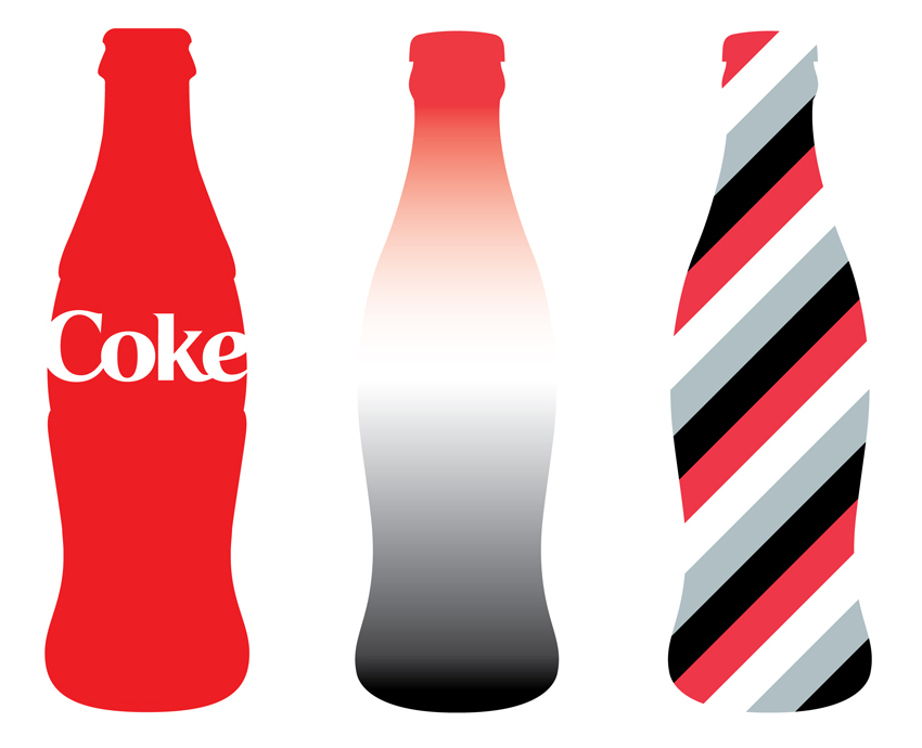
| On the third Coca Cola bottle, the main interesting thing about this image is the horizontal lines, as well as the colors. Usually horizontal lines indicated tension, but for this specific image I don't agree. I mean I'm not exactly jumping up and down in excitement, but I find it entertaining to look at? (: As for the second Coco Cola bottle, I like how the colors fade from dark to light back to dark. It catches your eyes attention. Lastly for the first bottle I find the text boring and so cliche. Typical red color and typical font. |
 |
| As for this picture, it uses horizontal and vertical lines, as well as some diagonal and curved. I think in a way all the lines balance and compliment each other in this picture. There's also color in here, black and white obviously. Personally I adore this picture. <3 |
 |
| This picture is psycho! Ha I absolutely love it! Anyways, the elements of design incorporated into this photo are without a doubt color and lines. There's a lot of chaos going on, a lot of zigzag lines which indicate restlessness and this picture definitely portrays that greatly. The colors purple, orange, yellow, white, and pink compliment each other so well that no color is dominating another. |
 |
| Obviously this picture represents direction, literally. I chose it because one, I love it, and two it's a sign telling you what to do.. Or also known as giving direction. The street sign also gives direction as well. |
 |
| I chose this picture to represent shape. The fish and birds represent positive space, while everything else around them that isn't taken up by anything, represents negative space. |
 |
| For texture I chose to use snow as my example because it's implied texture looks hard and solid, but in reality it's REAL texture is in fact soft and instead of it being a solid it's a liquid. TRIIIIICKY! :) |
 |
| Value refers to the lightness and darkness of a photo, so with that being said, this photo shows both dark shading and light shading. On the first photo the artist puts a lot of emphasis on the dark areas of the photo to make the white areas POP. They do the same thing for the second and third one too, but on the fourth they use less and lighter shading to make the black pop this time. The little black dots especially pop because of the light shading behind them. Hm, I think I got everything? The end. :P |
i love it, the pictures that u chose and you u explained them vary well.
ReplyDeletethat was really good i like the " Love rd(one way do not enter) sign
ReplyDeleteI liked it alot theres nothing wrong with it at all good job
ReplyDeletei like it!!
ReplyDeleteThe images you used were OK. The only thing different is the sign.
ReplyDeletei like the picture of the birds and fish, especially the way they fit together.
ReplyDeletei love all the pictures! you did a good job finding all of the elements :)
ReplyDeleteYou chose interesting pictures! Good explanations for the elements.
ReplyDeletevery good. covered all the points with good descriptions.
ReplyDeleteI think you did a pretty good job overall. Very pretty pictures you chose. :)
ReplyDeletereally cool pictures very different and insane and you did a great job explaining it
ReplyDeleteEverything fits together well, great discription.
ReplyDeleteGood pictures and good fairly long explanations.
ReplyDeleteI like it, all your imagines were good but explain the elements more.
ReplyDeleteIt's really good. Liked the pics.
ReplyDeleteExcellent work! You really got the feel for what the pictures were. Also, even though you had many pictures, you described each of them good enough instead of just saying one thing for them. Also, you put in your personall opinion as well.
ReplyDeletePretty Pictures. Good description on them as well
ReplyDelete